Difference between revisions of "TNT en Amérique"
m (Text replacement - "Category:Artists' publishing Category:Conceptual comics" to "Category:Conceptual comics") |
|||
| Line 41: | Line 41: | ||
</onlyinclude> | </onlyinclude> | ||
| − | + | [[Category:Conceptual comics]] [[Category:Publication]] | |
Latest revision as of 09:38, 11 May 2021
 | |
| Author | Jochen Gerner |
|---|---|
| Language | French |
| Publisher | L'Ampoule (28€) |
| City | Paris |
| Date | 2002 |
| Pages | 66 |
| Format | 22,3 cm x 29,5 cm |
| Fabrication | 1 affiche insérée. Relié avec dos toilé |
| ISBN | 978-2-848040-00-9 |
| E-book | PDF (94 mb) |
“The main interest for me of the comic strip is the infinite possible links between text and image: a system of representation continually confronting, in a kind of alchemy, text and picture. This is the field I endeavour to explore on my own or with OuBaPo (Ouvroir de Bande dessinée Potentielle).
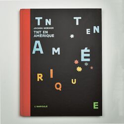
The idea for TNT en Amérique sprang from these remarks with OuBaPo, from exercises, experiments. I try to find new reading perspectives. I dismantle a given material to make something else of it.
Through analysing Hergé’s comic strip Tintin en Amérique I realized the recurring incident of fall (of bodies) in this book. I wanted to understand where this permanent giddiness came from. Early 2001, I began to understand this violence (violence always softened and made seem ordinary thanks to the clear line of the drawing: getting punched is much more violent than what is shown in this kind of book) and I decided it would be the opportunity to do an “oubapian” exercise with the whole book.
Therefore all this was only a personal experience at the beginning. I first analyzed and dissected the text in Hergé’s balloons. Then I kept the words for their meanings (in relation with the violence and the symbolical themes of American society) and their musical qualities. I drew up lists.
I tried to elaborate sets of themes according to the pages. At that time, I began to blacken Hergé’s drawings letting out only the words I thought important. Later on, I found the graphic solution by enlightening this black with “openings” on colour, while completing the text by images. Black has then become night since all these coloured spots (signs, pictograms, simple symbols) were becoming urban little lights, pop neon lights flickering in the violent darkness of the American city. A kind of tentacular city watched by night from the sky or a promontory ( a recurrent scene in American films). Black in reference to censorship, to night, to darkness ( evil ), the mystery of uncompletely revealed things.
On a dense black background, light coloured vignettes tell a story of American violence through their sequene and insistence: I bring up this phenomenon as well as the notions of noises, movements, money, religion, Good and Evil connected to it (the first moving neon sign in the United States was used to announce a death sentence). This night is an “American night”: a filter on an image taken in daylight to give the illusion of night.
The reader’s mind (who should have read Tintin en Amérique beforehand) must be able to go from Hergé’s underlying work to my graphic indications and back. This graphic intervention is as much about America through one of Hergé’s comic strip, as it is about Hergé’s work through the themes about America.
For these two universes, Hergé’s light line and American society can be understood in the same way: both worlds apparently rich, beautiful, smooth, but radically dark and violent. So I was able, thanks to reframing, masking, covering up to use a given material in order to examine its unexploited contents as well as its obscure zones.
From a technical point of view, I bought (in shops specialized in old editions) old copies of Tintin en Amérique. Therefore I worked directly on the printed editions by cutting the pages one by one and covering them thickly with black ink. The elements of the original work were not to be seen showing through. It is for the same reason the publisher suggested I should rewrite the selected words myself for the printed version because Hergé’s handwriting could not be copied without authorization.
The book was logically made by following the covering up concept thoroughly. Every word in its original place, each page in its place in the book. The publisher’s address and the colophon were put in the same places. The flyleaves and the clothbound back refer to Hergé’s original editions.
I did not see this book as a “technical feat” but as the discovery of a secret passage , of a dark track followed to the end. I do not try to respect a fixed form or to keep faithful readers through my style of drawing. I make my books according to the theme and the issue at stake.
This book was published in 2002 by Ampoule publishers. After September 11th 2001, when I was working on this book, I did not change anything about my work. At that time I had chosen all the words I was to keep, I had written the quatrains placed at the end of the book. I had also drawn the first fifteen pages. Later on I realized I was working on topical questions. Some sequences in TNT en Amérique strangely echoed perfectly what was going on at the time: bomb attack/ terror/revenge/pursuit/cave/dollars/crisis.
Last, this book was not made against Tintin or for Tintin but about Tintin. A piece of work on and about the comic strip.” (author’s statement)