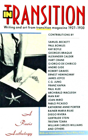
In Transition: A Paris Anthology: Writing and Art from Transition Magazine 1927-30 (1990)
Filed under book, magazine, poetry | Tags: · art, avant-garde, dada, expressionism, literary theory, literature, poetry, surrealism

A selection of the some of the best writing to appear in transition, an experimental literary journal that featured surrealist, expressionist, and Dada art and artists. Founded in 1927 by Paris-based poet Eugene Jolas, it was originally intended to serve as an outlet for experimental poetry, but gradually expanded to incorporate contributions from sculptors, photographers, writers, civil rights activists, critics, and cartoonists. The magazine ran through the spring of 1938, with a total of 27 issues published.
With texts by Samuel Beckett, Paul Bowles, Kay Boyle, Georges Braque, Alexander Calder, Hart Crane, Giorgio De Chirico, Andre Gide, Robert Graves, Ernest Hemingway, James Joyce, C. G. Jung, Franz Kafka, Paul Klee, Archibald MacLeish, Man Ray, Joan Miro, Pablo Picasso, Katherine Anne Porter, Rainer Maria Rilke, Diego Rivera, Gertrude Stein, Tristan Tzara, William Carlos Williams and others.
With an Introduction by Noel Riley Fitch
Publisher Anchor Books, Doubleday, New York, 1990
ISBN 0385411502, 9780385411509
256 pages
via leninbert
PDF
Scans of 18 issues of the magazine (at National Library of France)
Kyōjirō Hagiwara: Death Sentence (1925) [Japanese]
Filed under poetry | Tags: · avant-garde, dada, graphic design, japan, poetry, typography, visual poetry

The poetry anthology Shikei senkoku “is one of Mavo’s best-known projects and the group’s only collaborative book design. Mavo executed the entire layout of Hagiwara’s anthology, deciding everything down to the pitch of the text. It is one of the finest examples of a successful integration of text, design, typography, and illustration.
At the time, Shikei senkoku was considered extremely experimental graphically. As Takahashi Shūichirō has noted, it was designed to fit Hagiwara’s persona as a kuroki hannin (black criminal, that is, an anarchist). Without the artistic constraints placed on many commercial publications, Mavo artists were free to produce a strong visual response to the tumultuous poems. Okada did most of the illustrations for the volume, as well as designing the cover. It consists of two bold black lattices on both the left and right borders, a yellow band at the top with the author’s name, a thicker red band with the book title below this, a bluish circle in the center, and a black-and-white grid pattern at the bottom with boxes filled in to create an abstract pattern. The tide consists of irregularly rendered, blocky characters, playfully tilted against one another, creating a horizontal rhythm across the top of the book.
Several of the illustrations inside Shikei senkoku are photographic reproductions of Mavo work already published in the group’s magazine. The rest are abstract linocuts. Line, dot, and arrow border patterns dynamically frame the texts, which are interspersed with full-page illustrations, some featuring bold, black-and-white abstract patterns.
In one example, illustrations by Okada Tatsuo and Yabashi Kimimaro face each other (pp 34-35). Okada’s untitled print, on the right-hand page, is largely rectilinear, with a few crisscrossing diagonals. The Still Life Yawns, Yabashi’s work on the left-hand page, consists of a black rectangular form with white areas cut away inside, producing free-form shapes. In another of Okada’s many untitled designs in Shikei senkoku, an anthropomorphic head springs into the composition from the left, its segmented neck pierced by a long protruding cone; black-and-white abstract shapes and line patterns animate the background (p 155). The typography used for the poems is also experimental, often incorporating symbols and shapes to substitute for characters and letters (pp 130-131).” (from Gennifer Weisenfeld, Mavo, 2002, pp 197-200)
With illustrations by Mavo (Tatsuo Okada, Kimimaro Yabashi, Tomoyoshi Murayama, Masamu Yanase, Hisao Maki, Shuzo Oura, Seiho Sawa, Tatsuo Toda, Michinao Takamizawa)
Publisher Chōryūsha, Tokyo, 1925
161+6 pages
via Waseda University Library, (2)
Commentary (John Solt, 1999)
MAVO at Monoskop wiki
PDF, JPGs (First edition, PDF 46 MB)
PDF, JPGs (Second edition, PDF 48 MB)
HTML (added on 2014-10-8)
Iliazd: Lidantiu faram (1923) [Russian]
Filed under artist publishing, play | Tags: · dada, futurism, poetry, typography, visual poetry, zaum

Lidantiu faram [Le-Dantyu as a Beacon] is a play typed in zaum language by the Georgian-French artist-typographer Iliazd (Ilya Zdanevich). It remains an unsurpassed example of visually fascinating typographical contrivances and was to exert a decisive influence on the typographical component of international dadaist poetry.
“The book is preceded by a table of symbols which indicate how the sounds they stand for, such as a click of the tongue, are to be pronounced. The stressed symbol is given a capital letter, often large and bold, in the middle of the word, while unstressed vowels are written as pronounced, not necessarily as normally spelt.
The plot, in a parodic inversion of Gogol’s short story ‘The Portrait’, investigates the nature of reality in its relation to art. It begins with the Spirit [Zaperedukhyai] muttering a soliloquy over the body of a dead woman. The Spirit’s words do not contain vowels, an omission suggesting firmness. The villain of the piece, the realist painter [peredvizhnik] who is presented as a lisping phoney, paints a lifelike portrait of the dead woman. Then comes an obscure avant-garde artist, Mikhail Ledentu, who represents genuine liberated art and he paints an unlike portrait of the same lady. Both portraits come alive during the play, with Unlike killing Lifelike. The Spirit also dies but the forces of life are resurrected. The play ends with an ensemble superimposed on each other: the harmonious trio of the living is echoed by the dissonant octet of the dead. The forces of death include a Greek chorus of five ugly realism-loving women, usually singing in quintet. They are defined as truperdy (this combines death and decay with scatology) and their individual names are mostly rare Russian folk words with sexual anatomical meanings. The quintets show strong individualisation of each part: one of them speaks in vowels only; another hissing and lisping; another in abrupt and primitive tones adding clicks of her tongue to her words; the other two speak in a coarse and unpleasant idiom.
Le-Dantyu as a Beacon is an astonishing tour-de-force. Every page number, for instance, is created in a different and inventive manner (and there are sixty-one of them), and the variety of typeforms used must surely have entailed ransacking the typecases of several printers.” (from Alan Bartram’s Futurist Typography and the Liberated Text, 2005, altered)
Lidantiu faram (Лидантю фарам; Ledentu le Phare: poème dramatique en zaoum)
Preface by Georges Ribemont-Dessaignes, in French (attached at the end)
Cover by N. Granowsky
Typography by Ilya Zdanevich
Publisher Éditions du 41º, Paris, 1923
61 pages + 8-page prospectus
Commentary: Lewis Blackwell (20th-century Type, 2004: 35), Alan Bartram (Futurist Typography, 2005: 50-69).
PDF (15 MB, via Iowa Digital Library)
PDF (107 MB, added on 2020-12-5, via Kunsthaus Zurich)

