Kurt Schwitters, Käte Steinitz, Theo van Doesburg: Die Scheuche: Märchen (1925–) [DE, EN, ES]
Filed under artist publishing, children's book | Tags: · dada, de stijl, graphic design, typography
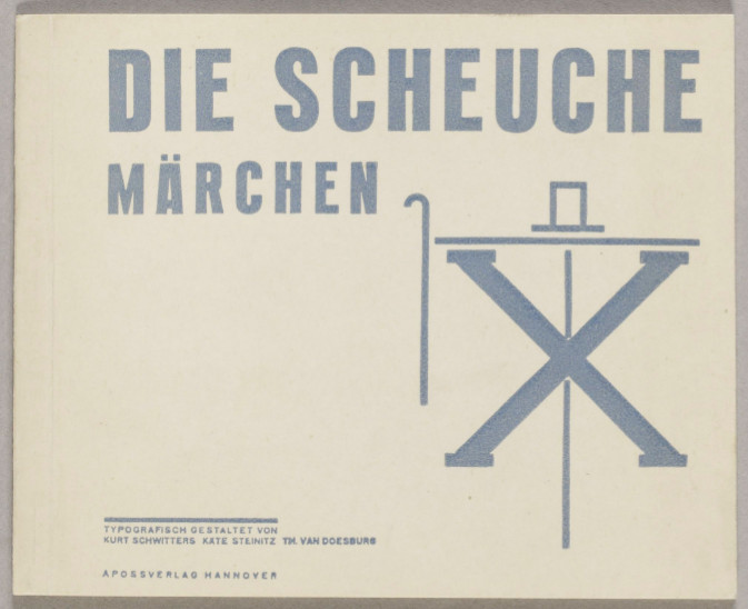
“In Die Scheuche: Märchen [The Scarecrow: A Fairytale] phrasing borrowed from German fairytales, grammar lessons, and religious texts combine into a formal hybrid that is cast in type. For the creators of this children’s book, such serious play with ready-made genres and print components offered a means of collecting the fragments of the past and assembling them to rebuild for the future. The narrative itself thematizes this pursuit: “once upon a time” there was a scarecrow well-appointed in the accoutrements of bourgeoisie comfort, complete with frockcoat, lace scarf, and cane. He is mocked by fowl and beaten by the farmer who made him. A child then pries the cane from the farmer (who has stolen it from the scarecrow) and with a single blow dismantles the order of ownership. The story ends with the ghosts of the items’ erstwhile owners arriving to reclaim their effects.” (Source)
Publisher Apossverlag, Hannover, 1925
12 pages, 13 x 16 cm
via Kunsthaus Zurich
Commentary: Leslie Atzmon (Design Issues, 1996)
Die Scheuche: Märchen (German, 1925, 22 MB, updated on 2020-9-5)
The Scarecrow (English, trans. Jack Zipes, typogr. Barrie Tullet, 2009, partial view on Google Books)
El espantapajaros. Cuento (Spanish, 2012, added on 2017-10-3)
Staatliches Bauhaus Weimar, 1919-1923 (1923) [German]
Filed under book | Tags: · architecture, art, art education, bauhaus, dance, design, drawing, education, film, painting, photography, sculpture, theatre, typography, weimar republic
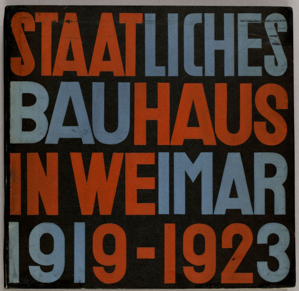
This work was published on the occasion of the major Bauhaus exhibition in August and September 1923 in 2,000 copies (another 300 were printed in English and 300 in Russian). The colour plates include nine original lithographs by Herbert Bayer, Marcel Breuer, L. Hirschfeld-Mack (2), R. Paris, P. Keler and W. Molar, K. Schmidt (2), and F. Schleifer. The texts are by Walter Gropius, Lyonel Feininger, Paul Klee, Gertrud Grunow, Wassily Kandinsky, László Moholy-Nagy, Oskar Schlemmer, Johannes Itten, Georg Muche, Lothar Schreyer, Gerhard Marcks, Adolf Meyer and others.
Publisher Bauhausverlag, Weimar and Munich, 1923
Typography L. Moholy-Nagy
Cover design Herbert Mayer
Print F. Bruckmann, Munich (texts), V. Lübecke, Erfurt (printing blocks for the 4-color prints), and Dietsch & Brückner, Weimar (colour plates)
225 pages, 20 colour plates, 147 halftone ills., 25 × 26 cm
via Bibliothèque Kandinsky
PDF (325 MB, updated on 2018-3-6)
See also Bauhaus publications on Monoskop wiki.
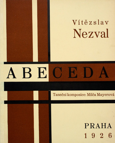
Vítězslav Nezval: Abeceda (1926)
Filed under artist publishing, poetry | Tags: · alphabet, avant-garde, dance, photography, poetry, typography
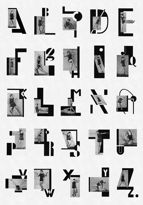
“In Nezval’s Abeceda, a cycle of rhymes based on the shapes of letters, I tried to create a ‘typofoto’ of a purely abstract and poetic nature, setting into graphic poetry what Nezval set into verbal poetry in his verse, both being poems evoking the magic signs of the alphabet.” – Karel Teige
The 1926 book Abeceda [Alphabet] is a landmark work of the artists’ collective Devětsil, active in Prague and Brno in the 1920s.
“The composition of Abeceda took place in three stages. Vítězslav Nezval wrote the poem in 1922 along the line of the grade-school syllabary, matching each letter of the alphabet with a single rhyming quatrain. Nearly every verse takes its lead from the visual aspect of its letter and proceeds as a sequence of fanciful associations: “A / let us call you a simple hut / Transport your tropics to the Moldau, o palms / A snail has its simple home with feelers sticking up / while people don’t know where to lay their heads.” For a celebratory Nezval evening in 1926 at the Liberated Theater in Prague, Milča Mayerová contributed a choreographed alphabet that complemented each quatrain with a sequence of poses. The composition concluded with Karel Teige’s addition of photo-montages that join photographs of Mayerová’s embodied alphabet with his own geometric letterforms.
Nezval’s verses follow from his conviction that poetry, as a game of language played at the level of its rudiments, provided a means of transforming the world directly. The photos of Mayerová illustrate in concrete terms this intimacy between language and reality; the poses have her almost trying the alphabet on for size. Teige’s photomontages organize that alphabetized figure with geometric letters according to the structure of the grid, which the artist regarded as an emblem of rational order. In setting Mayerová’s figure in gridded relation to the alphabet, Teige seemed to be insisting that readers consider the realities of life in relation to letters whose shapes they not only determine, but that in turn determine them.” (Source)
Abeceda. Taneční komposice Milči Mayerové
Publisher J. Otto, Prague, 1926
Illustrated with 25 black and white photomontages
57 pages
via V&A
Video adaptation (8 min, 2000, made at the Wolfsonian-FIU, Miami)
PDF (with Nezval’s poems in Czech, low resolution)
PDF (images only, low resolution)